 Florida Resources and Environmental Analysis CenterFlorida Resources and Environmental Analysis Center
Visual Analytics can pair with GIS maps to give a more complete perspective of the data. Below are several examples of how visual analytics can be used.
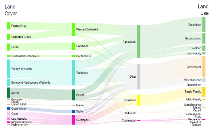
Sankey diagrams show flows and quantities for many-to-many relationships. The image below shows acreages of Land Use and Land Cover for the full state of Florida. The second diagram shows a breakdown of secondary categories.
Land Cover is the physical properties that can be observed on the ground and Land Use is how humans use the land. It is interesting to note the relationships between the two are more complex than we might have previously thought. For example, it it possible for Residential Land Use to occur in a variety of Land Covers, such as: Forested, Developed, and Cultivated. Agricultural Land Use can occur in Developed, Cultivated, Forested, and other Land Covers. Sankey diagrams are an excellent tool for visualizing the complexities between related entities.
For more information on Florida's Land Use and Land Cover, see the full description, which includes a poster and downloadable data.
 >
>
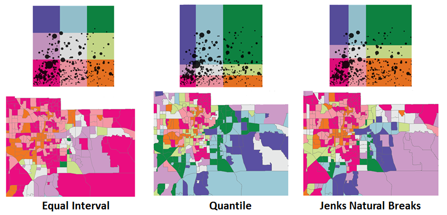
Statistical legends contain more quantitative information than traditional legends.The statistical legends give the reader a more complete view of the data distribution. The scatterplot included in the legends remains the same for all legends as the data distribution is the same for all maps.
Spatial representation of data is a main focus of GIS. Visual analytics offers a complementary perspective by separating the data from its spatial element in order to show relationships between variables in a more direct format. Scatterplots are useful tools for accomplishing this goal.
This project introduces scatterplots as a complementary tool to GIS. The first section discusses their capabilities with a demonstration of their use in a GIS legend. The second section is an interactive data visualization -- make your own scatterplots! Explore 2010 census block group data in your county with this easy-to-use web tool.
The goals of this project are: