 Florida Resources and Environmental Analysis CenterFlorida Resources and Environmental Analysis Center
Bivariate maps show two phenomena on the same map. This type of mapping has potential to reveal relationships and patterns between two types of data more effectively than side-by-side univariate maps.
Our bivariate methods can use a combination of selected colors and symbologies to convey the map's information.
See the examples below and visit the full bivariate page for more information on bivariate mapping.
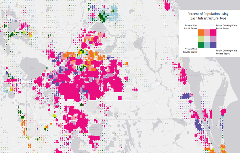
Below is an example of a population map showing Public and Private Drinking and Wastewater Methods. The grid cells use color to show the proportion of population using each public or private method as shown in the legend. For example, a pink cell indicates a high percentage of population using both public drinking and wastewater infrastructures; while a green cell shows most of the population using private infrastructures. The grid cell symbols are then sized to show the population -- larger grids have a higher population than smaller grids. The overall effect is that map readers can scan the map to see pockets of high and low populations and the combination of public/private water infrastructures used.
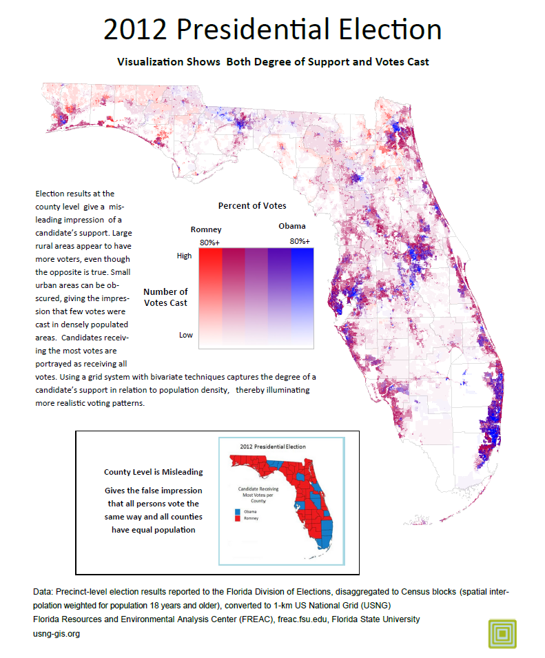
Election results shown at the county level are often misleading -- they give the impression that everyone in the county voted the same way and all counties have equal population. Candidates receiving the most votes are falsely credited with receiving all votes.
A high-resolution bivariate map reveals the nuances of votes. The map below shades each 1-km grid cell to show the percentage of votes for each candidate. Second, transparency is used to show population.
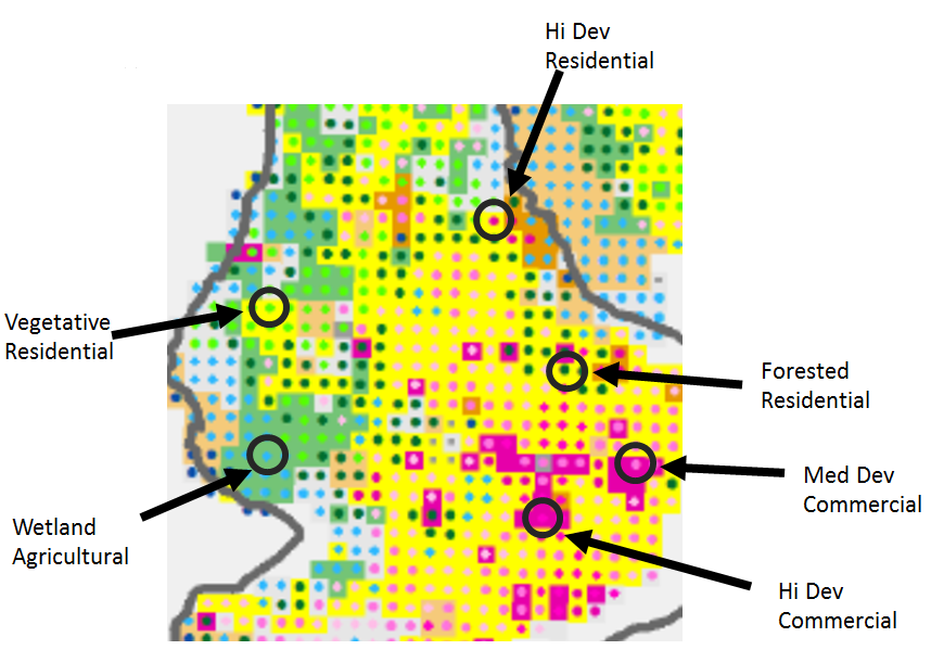
The concepts of 'land use' and 'land cover' are used to convey information about a landscape. Although land use and land cover are vastly different concepts, the terms have become intermingled in GIScience, resulting in a simpli-fied one-to-one relationship that can be visualized using univariate mapping techniques. This research posits that the many-to-many relationships between land use and land cover are complex and can be represented bivariately. Our project seeks to develop a visualization that shows both datasets simultaneously while allowing them to be visualized separately.
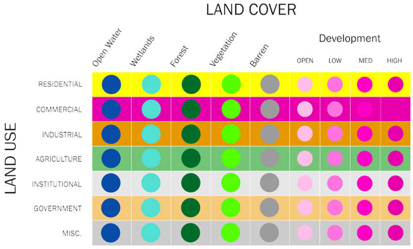
Symbology is a way to represent both datasets in the same spatial unit. We used nested symbology by overlaying a circle over a square. The Gestalt figure/background principle tells us that the map reader can distinguish between figure and background and switch between the two at will. Because land cover is an observable feature and thus readily un-derstandable by viewers, we chose to place land cover as the figure, represented by a circle. Alternatively land use is a more abstract concept and we placed it in the background with a square.
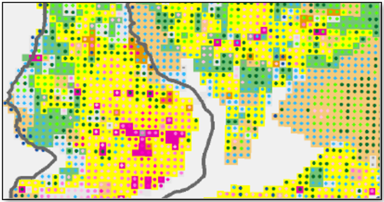
The images below demonstrate examples of this method and the corresponding legend.